Wednesday, January 30, 2008

SPACE PLANS FIRST FLOOR

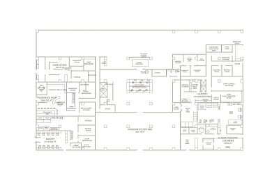
Here is the space plan that I have done for my first floor. I had to eliminate one of my retail spaces to incorporate a parking garage and entrance feature for the hotel. I am still working out the details of the lobby area and details associated with the sprinkling of the interior courtyard. Based on observation of the design building, it appears that the sprinklers are placed at the top of the building in a linear fashion.
Each of the retail spaces was researched to determine the appropriate equipment, i.e. the dry cleaners and thhe bakery.


The next image is of my revised logo. I took away some of the alternating colors and lightened the blue tone. This way the W is in the same text and is simplistic and unaltered. The W itself is outlined with a strip of blue.



Friday, January 18, 2008

Today, in class, I worked on revising my rough draft of my schedule that is due next Wednesday. Thus far, I have separated the tasks according to the time allotted for individual elements, such as space planning, rendering, different technical drawings, construction document drawings for retail space, etc.

Thursday, January 17, 2008

COMPLETED LOGO DESIGNS

This is the final format for my logo with the individual descriptions about each of them. I figured out the text that was used and it resembles Twentieth Century MT very closely. I decided to keep this font for the W and try different fonts for the Hotel Riviere Portion of the logo. The W used as the first example is the current logo used for the W Hotel.

LOGO DESIGN

Here are the three ideas that I have developed thus far of my logo design. Since I am doing the W Hotel, I am trying to use the same font, but give the logo a little regional variation. The font is unique to the hotel so most audiences should be able to recognize the logo even though a few changes have been made to the graphics and visual component of the logo design. This far, the font type that resembles this font the most is called Avant Garde.

Monday, January 14, 2008

LOGO ASSIGNMENT

Here is a general idea of logos that I am analyzing for the Research portion of the graphics for my senior project. I chose two logos from the W Hotel website since this is the chain hotel that I am pursuing for my studio project. The third is from a restaurant named Costa Pacifica. I found all of the logos to be simplistic and modern in appearance.